Information Architecture on the Bay
March 2021, Janice Cheng with Andrew Jankowski, Ian Gabriel, Jennifer Jiang, and Justine Moore
The Hudson’s Bay Company is the oldest surviving company in North America and one of the oldest operating companies in the world, having been around since 1670, in the days of the Canadian fur trade. It’s managed to maintain a strong presence even in today’s digital-first culture, ranking #2 in Canadian Online Stores according to eCommerce Database.com in 2021.
As part of a 2-week design challenge at General Assembly, our team of designers were curious to learn how this oldest surviving company was holding up to modern usability standards, and how we might empower higher sales conversion for this e-commerce giant on Bay.com.
Project Timeline
We followed a modified d.school design process, from discovery through ideation, testing, and hand-off in a 14-day period. My roles were focused around information architecture, content strategy, and visual design.
Problem Discovery
User Research
Discovery started with user interviews and task observation with 6 Bay shoppers over Zoom. Our users described themselves anywhere from “frequent” to “occasional” shoppers. Some users preferred to shop with a goal in mind, while others preferred to browse.
We synthesized user needs and frustrations on an affinity map, and developed a persona called Kyle. Kyle is an occasional shopper browsing a gift for a special occasion. He doesn’t have a particular item in mind to shop for; he is browsing Bay.com for ideas.
Fig 1. A persona emerged from user interviews and task observation.

Problem Space
“Wait, I thought I was already in the Men’s section?”
Our user’s frustrations fall into two major categories related to navigation and content strategy, involving clicking into unhelpful things at ineffective points on the user journey.
User Journey
The gif below illustrates Kyle’s user journey. Kyle starts at the navigation bar, clicks into the Men’s section, ends up on a lead generation page, and gets distracted by a visual menu located at the top of the page. Before he knows it, he’s going in a loop.
This user flow describes his experience.
Fig 2. A redundant menu structure makes the user continuously refine-search.
Information Architecture
Zooming out to the larger goal of reaching the check-out page, we can see that the user path illustrated in Figure 2 repeats at least three times if the user doesn’t use the direct search bar to refine his search.
Fig 3. User task flow illustrating the user’s goal of reaching the check-out page.
The figures below show how the user is being shown a filtered search starting with 17,333 results starting with the Men’s section, eventually filtering down to 270 results at the Dress Shirts section before he can start browsing for his gift.
Fig 4. Action/decision loop asks the user to filter more information at every new level.
Design Strategy
In understanding the problem space, our team decided to focus on three areas to improve our user’s navigation experience: information architecture, content strategy, and visual design.
Competitive Task Analysis
We looked at competitors like Nordstrom and Saks Fifth Avenue to understand industry best practices in navigation and information architecture.
Fig 5. Competitive task analysis of online retail competitor Nordstrom.
By contrast, Hudson’s Bay online retail competitor Nordstrom brings the user into a targeted search and returns only 76 results after one click from the navigation bar.
Information Architecture
When looking at the navigation menu categories and subsets, we realized that we can drastically shorten the search by changing one interaction from the navigation menu.
Fig 6. Search categories and subsets in the Men’s section at Bay.com.
By asking the user to select down to the narrowest possible subsection directly from the navigation bar, we can narrow results from 17,333 to 270 directly, contributing to a 64x more efficient search.
Content Strategy
Next, we considered the placement of the visual menu that appears at the top of the results page.
Fig 7. A/B test for the placement of the visual menu on the results page.
We hypothesized that our proposed changes to the information architecture at the navigation bar level would decrease users’ interactions with the visual menu, and assumed that the menu would be distracting and detracting from the search experience.
When we conducted an A/B test to validate our assumption, the results were mixed.
Fig 8. Detail of user interaction with lead generating visual menu.
Users didn't mind the menu at the top when they felt their goal of narrowing down a search had been met.
When their search goal had been met, some users preferred the top menu because it helped them explore the site in ways they hadn't been expecting.
Visual Design
Lastly, we looked at visual design with the goal of making the website more readable and navigable.
As the visual design lead, I created the design components and assets and led the efforts for a UI refresh.
Spacing & Sizing for Accessibility
Some users complained that certain buttons were too small. I increased white space and sizing throughout.
Colour Consistency & Accessibility
Text over images is hard to read. I fixed that, and ensured text and image colour consistency throughout the site.
Deliverables
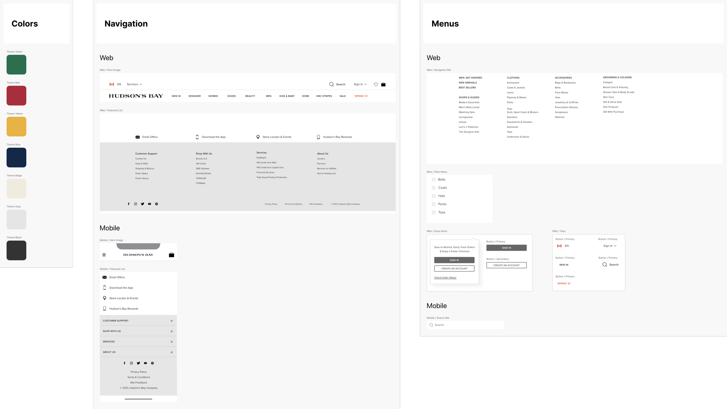
Design System
Here’s a look at the assets that I created on Figma.
User Interface Refresh
This is a before and after of the original website alongside our UI refresh. We focused on creating more legibility through white space and size consistency.
Final Solution
In conclusion, we made several updates on information architecture, content strategy, and visual design to contribute to a better navigation and shopping experience for Hudson’s Bay users.
The major breakthrough was reorganizing the category subsets and removing the click interaction from the navigation bar to achieve a 64x boost in search effectiveness.
The new website has a 64x more efficient search, and a readable interface with bigger buttons and more consistent sizing and spacing.
Thanks for reading!
Why not take the next step? Let’s hop on a call.


